The code behind Pinterest's beautiful layout
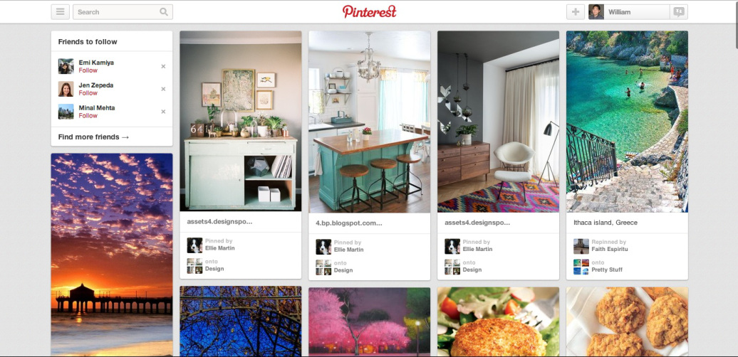
I love the Pinterest layout, the way each pin finds its perfect spot in nice neat columns on your board. I mean, just look at this!

I was quite curious to see how they do this because, in html/css, it is easy to organize elements horizontally and more of a feat to do anything else. So I decided to take a look at their code.
In case you wish to follow along in the code, I have prepared trimmed-down versions of the html and css, which are easier to understand. You can find them here.
The first important ingredient of this layout is the div containing all of the pins:
<div class="variableHeightLayout ... GridItems ..." style="height: 4665px;">
  ... items/pins ...
</div>
In particular, there is a style called .GridItems.variableHeightLayout>.item that grants the rule “position: absolute;” to each grid item.
Inside this containing div are all of the pins, also known as grid items.
<div style="height: 4665px;">
  <div style="top: 0px; left: 0px; visibility: visible;"> ... </div>
  <div style="top: 0px; left: 250px; visibility: visible;"> ... </div>
  <div style="top: 0px; left: 500px; visibility: visible;"> ... </div>
  <div style="top: 0px; left: 750px; visibility: visible;"> ... </div>
  <div style="top: 0px; left: 1000px; visibility: visible;"> ... </div>
  <div style="top: 238px; left: 0px; visibility: visible;"> ... </div>
  <div style="top: 324px; left: 500px; visibility: visible;"> ... </div>
  <div style="top: 362px; left: 250px; visibility: visible;"> ... </div>
  <div style="top: 431px; left: 750px; visibility: visible;"> ... </div>
  <div style="top: 622px; left: 1000px; visibility: visible;"> ... </div>
  <div style="top: 643px; left: 500px; visibility: visible;"> ... </div>
</div>
Note how each item has an inline style.
Both “left” and “top” are calculated individually for each pin. The “left” values are 0px, 250px, 500px, 750px, or 1000px, which is how 5 columns are laid out here. All pins, and hence each column, are constrained to 236px by the “.Pin.summary .pinWrapper” syle. The “top” values are calculated for each based on the pins above it. And this all works because of “position: absolute;” as inherited from the containing div.
While inline styles are generally discouraged, I must say this is quite a clever usage.
As for how “top” and “left” for each pin are calculated, that is controlled by the accompanying JS. That script runs every time a pinterest page is loaded, when additional pins are loaded, and when the window is resized (pinterest pages are adaptive and will lay out between 3 and 10 columns based on the width of your browser).
That script can be read if downloaded and unminified. Search for code that looks like “left=” and “top=”. I am going to end my exploration here because it’s a lot of JS. And besides, Pinterest employees kindly summarize that script here on Quora.